Image dimensions
Where to use images
You can use images on the Content and Service hub pages as well as the Newsroom Carousel and Homepage. See the image dimensions and examples below.
Content pages
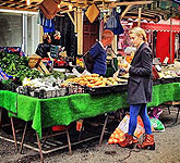
There are three choices of image sizes that can be used on content pages. Landscape image with caption, thumbnails and large image.
Landscape image with caption
Image dimensions are 400px width and 250px height.

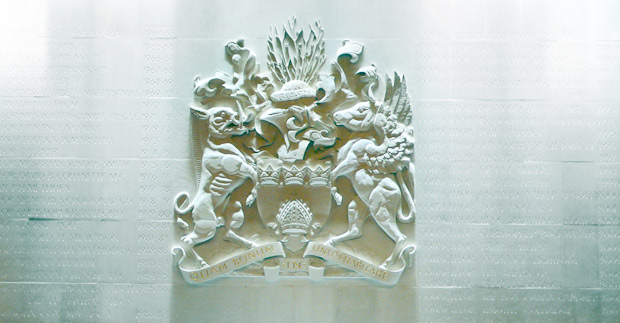
Crest of the Royal Borough of Kensington and Chelsea
Landscape image with caption. Image dimensions 400 pixels width by 250 pixels height. This is the recommended route for placing an image in a responsive layout.
Thumbnails
 Placement of thumbnail image is on the top right, use align right feature in the CMS. Thumbnail image dimensions 165 pixels width by 150 pixels height.
- Ideal for logo placements
- Fast download time of image
- Keeps image small size
Large image
To insert a large image use this format. Using the CMS insert a link on the text and link to the image, select 'new window' to link out.
Service hub pages

The service hub layout small thumbnail image, image dimensions are 91 pixels width by 94 pixels height.
Newsroom Images
Carousel
Image dimensions are 432px width and 283px height.

Newsletter images
Newsletter image dimensions are 500px width and 130px height.

Homepage
Latest news image
The Latest news image dimensions are 620px width and 323px height.

Leader's blog / Events image
During purdah the Leader's blog and image is replaced with a generic events and link through to an event content page. The generic event image ‘events_hp.jpg’ is used for the main image for desktop layout. For tablet and mobile layout we combine this image with a left image called ‘event-overlay.jpg’ to create a single landscape image.
The Leader's blog / Events image dimensions are 340px width and 323px height for desktop layout.
For tablet and mobile layout, the left image dimensions are 376px width and 357px height and the right image dimensions are 340px width and 323px height.
Note: the right image is the image you will see on the homepage in desktop layout.
Multiple images
- flickr embed
- template request
